
Brand identity for Thera Trust
Supporting a charity’s brand to leap forwards

Challenge
Thera Trust is a national charity made up of 14 companies across England, Scotland and Wales. They support adults with learning disabilities to lead great lives; at home, at work and within their communities.
When Thera Trust approached me, they recognised that their existing brand was no longer serving the organisation effectively. Created more than 25 years ago, the visual identity no longer reflected who they are today or where they want to go in the future.
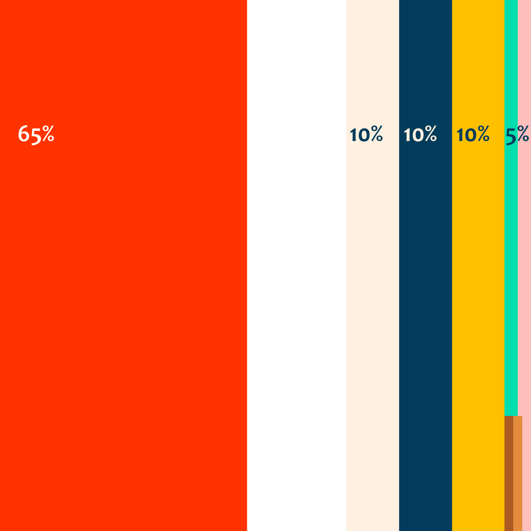
Accessibility was a significant challenge. The existing colour palette offered limited accessible combinations, and the team highlighted issues with legibility, including difficulties using the logo at smaller sizes.
The ambition was not to start over, but to evolve the brand, creating something more contemporary and accessible while retaining the energy, personality and history that make Thera Trust distinctive.
As a large and distributed organisation, it was equally important that the final identity could be adopted confidently by internal teams. The system needed enough flexibility and depth to feel distinctive, while remaining practical and easy to implement.
3,000
The number of people with learning
disabilities who Thera Trust support.
14
companies within the Thera Trust family,
across England, Scotland and Wales.
Solution
I worked closely with the team at Thera Trust to ensure collaboration sat at the centre of the process.
Following an initial scoping session, I developed a project timeline and facilitated discovery using my brand questionnaire framework to explore the organisation’s history, current challenges and future ambitions in more depth.
Stakeholder consultation was intentionally built into the process, giving teams across the organisation opportunities to contribute and shape the outcome. This helped ensure the identity genuinely reflected the people behind the organisation and created strong internal buy-in throughout the project.
I developed two contrasting creative routes, each rooted in the organisation’s origin story. Thera Trust takes inspiration from Greek mythology, specifically the island of Thira, whose people demonstrated resilience and determination after a devastating volcanic eruption. This story resonated with Thera’s founders and their mission to support adults with learning disabilities to overcome challenges and live fulfilling lives.
Alongside concept development, I analysed comparable brands and mapped visual trends across care and support sectors. Together, we identified opportunities to differentiate Thera Trust, including colours and conventions to avoid.
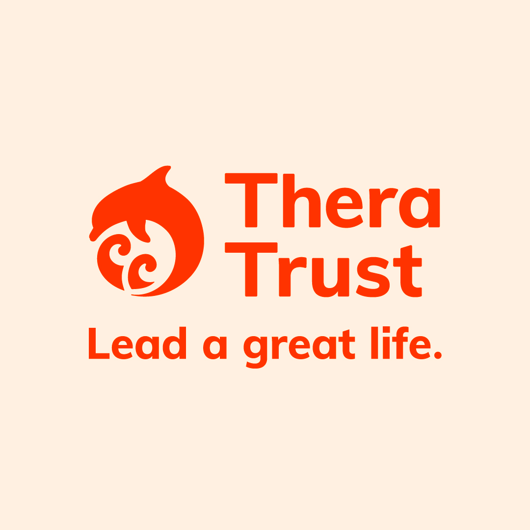
The chosen direction centred around a leaping dolphin emerging from choppy waves, a symbol of optimism, resilience and moving forwards. The revised logo improved legibility across formats and scales, while the standalone icon created flexibility for digital applications such as social media.
Through multiple rounds of refinement, we evolved the wider identity system including colour palette, illustration style, iconography and brand assets into a cohesive and usable toolkit.



Result
The collaborative process meant stakeholder feedback was embedded throughout development, resulting in a smooth transition and strong engagement when the new brand launched.
To support implementation across the organisation, I created two levels of brand guidance:
- A concise quick-reference guide for most staff, which focused on the essentials of applying the identity consistently.
- A comprehensive brand guidelines document for the internal communications team, providing deeper guidance across all elements of the system.
Both guides included approved colour combinations designed to meet WCAG AA accessibility standards.
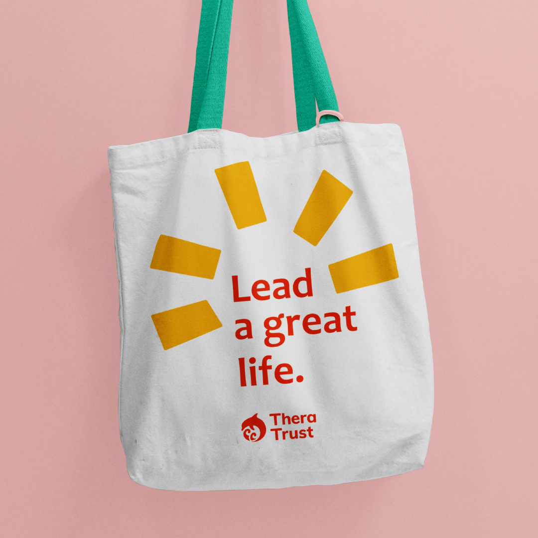
Final assets included logo lockups, icons, illustrations, typography guidance, colour systems, brand elements and sample layouts — all supplied in formats suitable for both print and digital use.
The feedback was overwhelmingly positive, and the client provided the below testimonial:
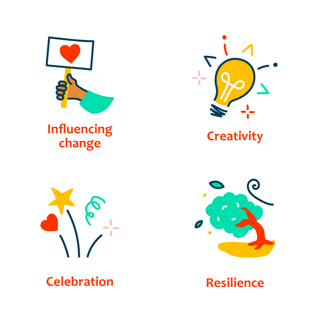


10
final values and mission illustrations,
summarising the organisation’s vision
44
pages of main guidelines, for the internal communications team to refer to



Deliverables
Logo design
Icon design
Illustration
Brand identity
Brand development
Collaborators
The team at Thera Trust.
Find out more about Thera Trust at
More Projects

Illustration for Sheffield Hallam University
Showing the way for civic engagement

Campaign for Sheffield City Council
Helping a community improve waste disposal

Advertising creative for BTHA
Creating a playful key visual for Toy Fair 2026